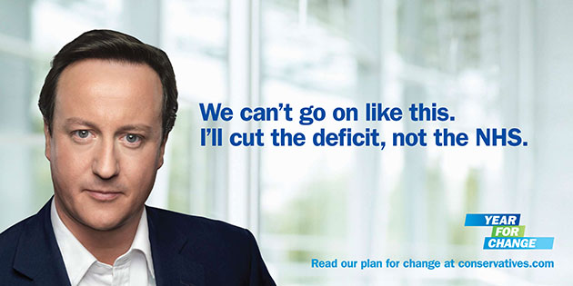
This campaign poster was created by the Conservative party to encourage adults to vote for David Cameron in the next general election. We know this as there is a large image of David Cameron on the left of the poster. David Cameron is using direct mode of address, he is doing this to engage with adults, it will grab readers attention and make people think that he is targeting them specifically as he is looking at them personally. He is wearing a black suit, this makes him stand out well against the white background. His facial expression is very serious, this shows he is serious about the election and that he wants to make a difference. It says "We cant go on like this, I'll cut the deficit, not the NHS." Because it says "I" it gives the impression that David Cameron said that and he will personally take action, this is very promising to his supporters and people who are not sure what party to vote for.
In the bottom right hand corner, it says "Year for change," this is showing that if you vote for the conservative party, David Cameron will change things for the better. Underneath that is a website that readers can go on to find out more information about the campaign, it also says "conservatives" in the website address, this makes it clear what party David Cameron is apart of to adults. The website address and logo above it are in blue, this is because the conservative party is usually associated with the colour blue, they usually use blue across different media platforms. The word "Change" is used twice on the poster, the Conservative party repeat the word as they really want to get their point across to people. Their aim is to change.

No comments:
Post a Comment