Labels

Friday, 22 November 2013

Final Name and Slogan- Megan Byford


Youth 4 Baldock

Why this name? Our group chose this name because it had both the name of the town we were regenerating in it, as well as the specific target audience in it. The 4 would make it shorter and also make it more playful. It stands out, it also gives the sense of enforcing the campaign, that it is only for the youth, it is to help and provide for them in a positive way. It also shows the aim of our campaign, without having to use the word 'regeneration'. This name is also clear and straight forward, meaning there would be little confusion about it and a simple name can either not be remembered, or it is so simple, it's easily rembered, for this name, we hope that it would be the latter.


 "Make Every Regeneration Count"


Why this slogan? We chose this slogan because it was catchy and it sends a simple but good message. It's clear and states the purpose of the campaign. It's making our campaign already sound successful, letting people know that this regeneration will really mean something to the community and that it'll make it a better place. We thought that it sounded quite bold and could be remembered easily, because it's simple and would stand out.

Tuesday, 19 November 2013

Public Awareness Campaign Poster Analysis

This campaign poster was made by the Home office to make people aware of the issue of abuse and that there is help available for those that are being abused. We can see that this poster is mainly aimed at teenage girls as the girl in the picture is a teenager and the first bit of writing "Are you his princess" is in a very girly font with a tiara, flowers and stars around it. This is to make it stand out to their target audience. We can also see that it is aimed at teenage girls because the second part of the heading, "and a stupid bitch the next" the language is quite strong so therefore it wouldn't be aimed at younger girls as the language used would be inappropriate for them. Around these words, are splats of paint, these could be splats of blood, showing that abuse can be very nasty as it could lead to blood. The heading is a rhetorical question, this is very effective to readers.

The girl on the poster looks very miserable, although we cant see her face we can tell from her body language, as she is sitting on the corner of her bed looking lonely and upset. She has her back faced to the window and she is hugging her knees, this could mean she doesn't want to go outside as she is scared and frightened to. This is showing that she is being abused and she should get help instead of suffering in silence, it also showing that other people should get help too otherwise they will end up like her. The colours in the picture are dull and dark, this shows that it is a negative issue.

There are two rhetorical questions underneath the heading, this is effective as it will make the readers think about if they are in the same situation and if so, that you shouldn't be treated like that. There slogan is very simple but it gets the point across very clearly, it is in bold so it stands out. It shows that if anyone is being treated in the same way as the girl in the poster, that it is abuse and they need to get help for it, this slogan encourages people to do that. In the bottom right hand corner is the logo and name of the company involved with the campaign. Underneath the slogan is information on how to get in touch with the company or to get help.

Political Campaign Poster Analysis

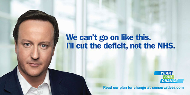
This campaign poster was created by the Conservative party to encourage adults to vote for David Cameron in the next general election. We know this as there is a large image of David Cameron on the left of the poster. David Cameron is using direct mode of address, he is doing this to engage with adults, it will grab readers attention and make people think that he is targeting them specifically as he is looking at them personally. He is wearing a black suit, this makes him stand out well against the white background. His facial expression is very serious, this shows he is serious about the election and that he wants to make a difference. It says "We cant go on like this, I'll cut the deficit, not the NHS." Because it says "I" it gives the impression that David Cameron said that and he will personally take action, this is very promising to his supporters and people who are not sure what party to vote for.

In the bottom right hand corner, it says "Year for change," this is showing that if you vote for the conservative party, David Cameron will change things for the better. Underneath that is a website that readers can go on to find out more information about the campaign, it also says "conservatives" in the website address, this makes it clear what party David Cameron is apart of to adults. The website address and logo above it are in blue, this is because the conservative party is usually associated with the colour blue, they usually use blue across different media platforms. The word "Change" is used twice on the poster, the Conservative party repeat the word as they really want to get their point across to people. Their aim is to change.
Election posters: Conservative poster featuring a large portrait of David Cameron


Public Health Campaign Poster Analysis


This poster is an NHS campaign about smoking, (National Health Service). This campaign has been made to show how dangerous it is to smoke and to put people off it who currently smoke. We know that the NHS have created this campaign because there logo is in the top right hand corner.

This campaign is aimed at smokers, particularly young adults. We know this because of the girl on the poster, she is very young and is also 'hooked' on smoking. This could also tell us that it is most popular for young adults than older adults to smoke. The girl on the poster looks sad and miserable, this could show smokers what smoking does to you and how being "hooked" on smoking isn't a fun. This poster is very shocking and eye-catching because of the fishing hook through her lip. This image is very clear about the point that the NHS are making to the public. This image would be unsettling for young teenagers and children, this would most likely put them off smoking for the future. The fishing hook through her lip would be unsettling for most people to see. The image looks very real as you can see the hook actually going through her upper lip. There are no bright colours in this poster, this shows that smoking is a dull, dark and negative habit to have. The impression you get from the poster is that the girl is unhappy because she smokes and what it is doing to her. 

The poster says that "The average smoker needs over five thousand cigarettes a year." This fact has been included in the poster because it is true and very shocking. It can also show how much money is wasted on cigarettes as five thousand of them isn't cheap.
The NHS use the word "unhooked" twice when they are showing how to get in touch if you want to get "unhooked." They use the word twice as the NHS are really trying to get their point across to the public and the word relates to the disturbing main image. People that smoke may find the image shocking, this is what the NHS is hoping for as they hope this campaign will stop as many people smoking as possible. Smokers might realise how bad smoking is for them and they might get into the process of getting "unhooked".

In the bottom right hand corner is the smoke free logo, this makes it obvious what the NHS are trying to achieve. They are trying to give a lot of support to smokers as they have given a telephone number they can call and a website address they can look at.

Plan and Evaluation For Leaflet Ideas

Leaflet Idea 1


Leaflet Idea 2


Leaflet Idea 3


Logo Ideas and Evaluation


1. This logo has a very youthful design, the popcorn represents activities such as cinema type screening, and the headphones could represent gaming and music. These kind of things are enjoyed by teenagers, so it makes it attractive and appealing to them. The 'paint' style could give the appeal of creativity and freedom. The colours are mixed, the green is a colour that can suit both female and males. These colours would also be used in our any art work for our slogan and name, and the themes would be used on all forms of our media.


 2. This logo is very simplistic, and has little colour. This could be a good thing because we can then put in  any other colours we want in the other forms of media, including the website, poster and leaflets. The hand sign is something that would convey a helping hand, meaning support and friendship, the star symbol is something that an be very youthful, especially as this one has a sign of graffiti also. The peace sign is to show a calm and safe atmostphere. Although it has meaning, this design may not be remembered and wouldn't be noticed easily.


 3. This design has a very friendly effect, a group of friends show the community that would be involved in the youth club. The fact they look young relates to our target audience. The fact that they are slightly drawn and look as if they have been painted makes it look very creative. The name of the campaign is there for people to see it easily. This design doesn't show activity or have many 'hidden' meanings and may look too childish for our target audience of 13-16. The font is 'Ignite the light' and it is handwritter, this relates the target to the target audience because it's writing.

Our Campaign Name Ideas


Sunday, 17 November 2013

Our Two linked products

What will your two linked products be?

We are going to create a website with 6 pages and a 2 minute TV campaign advert; these will be linked through us putting the same slogan, logo and campaign name. By ensuring our slogan, logo and name are on all of our different campaign adverts the public will make the connection between our adverts and our campaign. It will also mean that our campaign is instantly recognisable.

Wednesday, 13 November 2013

Feedback


From the feedback we have received, we will be more detailed in our next presentation about where our documentary will be shown, as we were not as clear about this in our first presentation. We have decided that we are going to create a TV advert/documentary that will be 2-3 minutes long. We are to regenerate the museum by doing up the outside by painting it and making it look generally nicer, we will also paint inside and use the separate rooms as different activities for the youth club; for example;e one room could have comfy chairs for sitting with friends and the other room could have a table tennis table or snooker table. We want the public to get involve by volunteering to help out with the regeneration, with painting and raising awareness.


Plans For Our Webpage


Tv Advert Brainstorm


Tuesday, 5 November 2013

Final Campaign Idea and Target Audience

Final Campaign Idea:

Our final campaign idea is to turn the current Baldock Museum into a Youth Club. After conducting two surveys we found that both the average public of Baldock and the teenagers who live here thought that Baldock would benefit from a Youth Club, due there only being one that currently runs in Baldock however this one is a Christian Youth Club and we felt that it excluded many people who may wish to attend a Youth Club but felt they couldn't due to not being Christian. Another reason we chose the museum as our venue for the Youth Club is because the museum is very underused and we thought that we can change this by re-developing the space and turning it into a Youth Club.


Final Campaign Target Audience:

Our final campaign target audience is 13-16 year olds We have chosen this range as out target audience because we think they are not too young but they have also not passed the age that is seen as too 'adult' for a Youth Club. From the people we asked in our targeted survey we found that they mainly between the ages of 13-16 and said that if a Youth Club was an option for them to go to then they would attend.

Sunday, 3 November 2013

Slogan Brainstorm and Evaluation


We came up with five different possible slogans and we asked other people for their opinions and to vote for which one they liked the most. The most popular slogan was "Make every Regeneration Count."